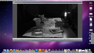
The genre of our film is a psychological thriller, it compares to other films of this genre as it doesn't give a away the whole plot in the first few minutes as well as keeping the main actor's identity a mystery for the audience. In terms of the camerawork, the angles we used fit well with this genre as we tried to not reveal too much in order to keep the opening more interesting and eye catching towards the audience. Our film uses a variety of different camera angles and shots just like other films of our genre, for example, a close up of the photograph in the chapel. The music that we are putting into our film sounds typical of the type of music used in horror films, it connotes eeriness, mystery, suspense and fear and that something 'bad' is going to happen. The opening sequence of other horror films such as the one researched (Scream) usually has only one character at the beginning and the character is usually in a rather neutral atmosphere and a neutral mood. At the start, everything is usually 'okay' and the audience doesn't guess that something bad is going to happen, so we too used this technique to make the audience feel more surprised when something bad actually does happen, demonstrated by the image below which shows the calm, neutral atmosphere and mood of the actress in the opening sequence of Scream. Likewise, the actress in our sequence is in a calm and neutral atmosphere-she is at home looking through some old photographs and the mise-en-scene as you can see in the background shows that she is in her house and quite comfortable, likewise, the mise-en-scene in our sequence shows the actress in her candlelit house which made the atmosphere quite homely.
The actress looking at her photos:
Other films and media products that are of similar genre to ours don't include dialogue in their openings, so we too decided not to include dialogue. However, we challenged the forms and conventions of the other films because we put the production name of the film after showing the first bit of the opening sequence rather than putting it after the opening sequence. This is because a character in the film blows a candle out and then it goes to a blackout where the production company of the film is displayed. We think this is effective because of the style in which it is done (girl blowing out the candle and then going to a blackout). This may attract the attention of the audience further as editing techniques such as this aren't always used in other film openings, for example other low budget films such as 'Brick', where the opening is much happier with the use of photos, presumably from the character's childhood.
An important prop in our media product are the photographs that the girl is looking through at the beginning. We used a close up to show one of the photographs because it has a significant meaning here but the audience at this stage will not know how this photo ties in with the plot of the story. We thought the close up was vital to include because close ups on props really do give clues to the audience of what to expect later in the film.
In terms of sound, we found it confusing as to whether we should use music or not. The quality of diegetic sound we captured was very good so we really wanted that to stand out for example the creaking of the gates you hear when watching our media product really captures the mood-it creates an eerie mood to it, as if something bad is going to happen. However, we thought a lack of non diegetic sound would not create the atmosphere we wanted. We did at the end decide to use sound suitable for the genre of the film.
No comments:
Post a Comment