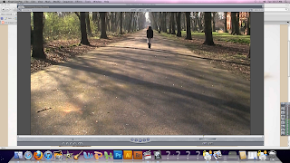
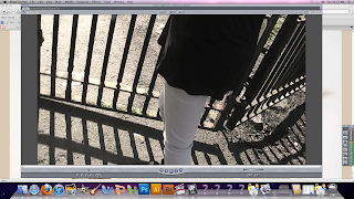
We have used a various amount of different techniques in order to define our genre, which is a thriller for example adding wind in one of the parts of the sequence in particular when the girl is walking down the path in the park, this was done to create an eerie atmosphere. We also created a sound track on Garage Band which compliments our genre and film. We also enhanced certain sounds, for example when the girl is opening the park gates, we added a more exaggerated creaky sound to make it more effective. In some parts of the sequence we used hand held shots for example when the girl is walking up the stairs, we did this to make it as if someone was watching the girl.
A medium close up was taken near to the end where the girl is near the fire looking to the side, which makes the audience more intrigued as to what's going to happen next.

We also filmed long shots of when the girl is walking through the park so the audience can follow what she's doing as well establishing the surroundings.

An over the shoulder shot was taken when the girl is sat down in the park looking over photos she's been carrying with her, we did this to make the audience feel more involved with the character. In terms of editing, at the beginning we used low-key lighting, then as the girl approaches the park gates, and opens the gate, the lighting changes from black and white low-key lighting to colour and daylight, we did this as we wanted the scene in the chapel to look scarier in comparison to the park where we wanted to keep it in natural light to enable the audience to see the fire near the end. Another aspect of the editing was the titles, we wanted the text of 'Disturbed' to fit in with the genre, and so we used an 'old fashioned' font, adding to mysterious feel of the opening. We also put the title of the film at the end of our opening, to leave the audience 'hanging on' in anticipation for the rest of the film.

The mise-en scene had a mysterious dark theme which included various elements, for example low-key lighting in the chapel which was done to create an ominous feeling, we also lit a candle at the beginning when the girl is rummaging through old photos. The mise-en-scene at the park mainly consisted of tall, dark trees and bushes with leaves scattered around, as well no-one else around except the girl, portraying a sense of isolation. We also lit a fire in which the girl is burning her old photos which would grab the attention of the audience, as throughout the opening so far, the girl has been 'neutral' in her actions, adding to the significance of the fire and leaving the audience wondering what it means and how it relates to the rest of the film.
The mise-en-scene of the character fits in well with her surroundings, the use of dark clothing e.g. a black top and long, dark hair suggest that the girl is in some sort of state and connotes a sense of the unknown. This goes well with the fact that the girl's face is barely shown and that no one knows who she is. Her feelings are portrayed through her actions i.e. lighting a fire, and are further exasperated through what she looks like and what she is wearing. This will attract the audience as they will be intrigued as to who the mystery girl is.
A medium close up was taken near to the end where the girl is near the fire looking to the side, which makes the audience more intrigued as to what's going to happen next.

We also filmed long shots of when the girl is walking through the park so the audience can follow what she's doing as well establishing the surroundings.

An over the shoulder shot was taken when the girl is sat down in the park looking over photos she's been carrying with her, we did this to make the audience feel more involved with the character. In terms of editing, at the beginning we used low-key lighting, then as the girl approaches the park gates, and opens the gate, the lighting changes from black and white low-key lighting to colour and daylight, we did this as we wanted the scene in the chapel to look scarier in comparison to the park where we wanted to keep it in natural light to enable the audience to see the fire near the end. Another aspect of the editing was the titles, we wanted the text of 'Disturbed' to fit in with the genre, and so we used an 'old fashioned' font, adding to mysterious feel of the opening. We also put the title of the film at the end of our opening, to leave the audience 'hanging on' in anticipation for the rest of the film.

The mise-en scene had a mysterious dark theme which included various elements, for example low-key lighting in the chapel which was done to create an ominous feeling, we also lit a candle at the beginning when the girl is rummaging through old photos. The mise-en-scene at the park mainly consisted of tall, dark trees and bushes with leaves scattered around, as well no-one else around except the girl, portraying a sense of isolation. We also lit a fire in which the girl is burning her old photos which would grab the attention of the audience, as throughout the opening so far, the girl has been 'neutral' in her actions, adding to the significance of the fire and leaving the audience wondering what it means and how it relates to the rest of the film.
The mise-en-scene of the character fits in well with her surroundings, the use of dark clothing e.g. a black top and long, dark hair suggest that the girl is in some sort of state and connotes a sense of the unknown. This goes well with the fact that the girl's face is barely shown and that no one knows who she is. Her feelings are portrayed through her actions i.e. lighting a fire, and are further exasperated through what she looks like and what she is wearing. This will attract the audience as they will be intrigued as to who the mystery girl is.
No comments:
Post a Comment