Wednesday, 11 May 2011
Tuesday, 12 April 2011
What have you learnt about technologies from the process of constructing this product?
We also learnt to edit effectively in order to make the film of good quality and to represent other typical psychological thriller films. Having too many effects didn't make the film look good so we decided to use a minimum amount of effects and also due the time limit, we decided to keep it plain and simple but effective in the way we captured shots, e.g. an establishing shot (pan) of the park as the film opening moves away from the chapel and into the next scene. The only visual effect we used was the black and white effect to give some parts of the film a classic, timeless quality to it and further add eeriness to the product, as a lot of horror films have black and white scenes to make them look as though they are filming in the dark/or in the past and to provide the audience with a sense of the unknown.
What kind of media institution would distribute your media product and why?
The best company that we think would distribute our film is Working Title 2 as they are a subsidiary company from Working title who are owned by Universal (which distributes aswell as produces films) and cater for films with a budget of no more than 5 million dollars. However, Working Title cater for films with budgets more than this, for example the film 'Diamond Skulls'.
Also, another distributor which could distribute 'Disturbed' is Optimum Releasing. This company was bought by the French media giant Canal Plus and has a distribution deal in place with the new low-budget film company 'Warp X'. It's titles include the highly successful 'This Is England' and other low budget projects such as 'Donkey Punch', which tells the tale of a holiday in Spain which goes drastically wrong. This film distributor would be suitable for our film as it specialises in distributing low budget films, and has experience of distributing films of the thriller/drama genre, similar to 'Disturbed' i.e. 'Donkey Punch'.
Shot From: Alice Sweet Alice
Looking back at the preliminary task, what do you think you have learnt from the progression from it to the full task?
Examples of the types of shots we used:
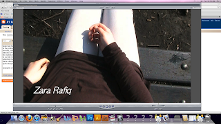
This is an example of a bird's-eye view shot
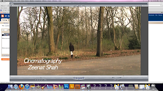
This is an example of a medium long shot:
How did you attract/address your audience?
A medium close up was taken near to the end where the girl is near the fire looking to the side, which makes the audience more intrigued as to what's going to happen next.

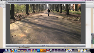
We also filmed long shots of when the girl is walking through the park so the audience can follow what she's doing as well establishing the surroundings.
An over the shoulder shot was taken when the girl is sat down in the park looking over photos she's been carrying with her, we did this to make the audience feel more involved with the character. In terms of editing, at the beginning we used low-key lighting, then as the girl approaches the park gates, and opens the gate, the lighting changes from black and white low-key lighting to colour and daylight, we did this as we wanted the scene in the chapel to look scarier in comparison to the park where we wanted to keep it in natural light to enable the audience to see the fire near the end. Another aspect of the editing was the titles, we wanted the text of 'Disturbed' to fit in with the genre, and so we used an 'old fashioned' font, adding to mysterious feel of the opening. We also put the title of the film at the end of our opening, to leave the audience 'hanging on' in anticipation for the rest of the film.
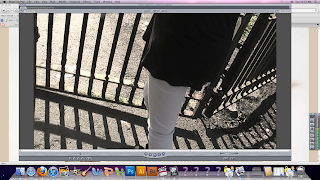
The mise-en scene had a mysterious dark theme which included various elements, for example low-key lighting in the chapel which was done to create an ominous feeling, we also lit a candle at the beginning when the girl is rummaging through old photos. The mise-en-scene at the park mainly consisted of tall, dark trees and bushes with leaves scattered around, as well no-one else around except the girl, portraying a sense of isolation. We also lit a fire in which the girl is burning her old photos which would grab the attention of the audience, as throughout the opening so far, the girl has been 'neutral' in her actions, adding to the significance of the fire and leaving the audience wondering what it means and how it relates to the rest of the film.
The mise-en-scene of the character fits in well with her surroundings, the use of dark clothing e.g. a black top and long, dark hair suggest that the girl is in some sort of state and connotes a sense of the unknown. This goes well with the fact that the girl's face is barely shown and that no one knows who she is. Her feelings are portrayed through her actions i.e. lighting a fire, and are further exasperated through what she looks like and what she is wearing. This will attract the audience as they will be intrigued as to who the mystery girl is.
Who would be the audience for your media project?
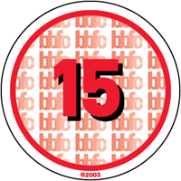
Although our audience ranges from males and females from the ages of 15+, adults from the age of 25 would probably appreciate the film more as it requires a lot of thinking and understanding from the audience and for the audience to 'solve the puzzle' which would probably interest an older teenager, as it doesn't contain images of gore or explicit scenes which might intrest someone of a younger age.
Our main target audience in terms of gender would be predominantly women and girls in their late teens. This is because the protagonist is a female; with the film being based around her life. However, thriller films and horror films also have a large target audience of men so our film would also attract males. Because the genre is a psychological thriller, our product is aimed at a niche audience. As mentioned before, people with specific interests in elements such as mystery, drama and processes of the mind would have interest in the film. However, this would be a smaller audience with more unique taste, rather than the majority audience who have more interest in romantic-comedies and dramas, in which they can relate to.
Tuesday, 5 April 2011
How does your media product represent particular social groups?
Our film opening introduces a young woman who is the main protagonist. The reason why we chose a young girl to be the main character is to create the effect that is similarly done in 'Scream' where the whole film plot is affected by a young girl’s actions, thus we try to emphasise her significance. The protagonist is casually looking through some old photogrpaphs at the start of the film, and a lot of people ocassionally look through old photographs for memories. However, what makes this girl different is that these photos bring back bad memories.
A young woman entering an isolated park and wanting to burn these old photographs that connects to her dark past shows her vulnerabilty by the fact that she is on her own in an isolated park, which could also show that she's on her own in this world. The audience won’t know that at this point, but in some ways it illustrates that she is vulnerable. This expected meaning challenges the stereotypes that people may have about young people. In addition, the opening of a film could be regarded as the most important part of the film as it shapes the plot of the rest of the film. In our opening production, we focused only on one character meaning that there is no involvement from other characters. This is vital as it demonstrates the importance of the character because the whole opening focuses on her. Immediately, we understand her significance to the story and how the rest of the story plot depends on her behaviour. In conclusion, our media product represents a young woman in a negative light even though the story plot revolves around her mysterious life. It is not clear from watching our film opening that the character has great importance in the rest of the film. Our film opening explores a traumatic past of a young girl who is haunted by a memory from her past and we approached this subject in a very subtle way. This is because we did not want to overcomplicate the situation thus meaning that we left hints all the way through the opening of the film so that the audience themselves can figure it out.
Tuesday, 29 March 2011
In what ways does your media product use, develop or challenge forms and conventions of real media products?
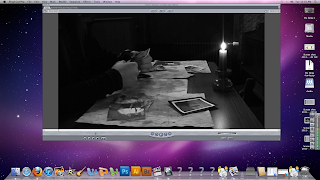
Other films and media products that are of similar genre to ours don't include dialogue in their openings, so we too decided not to include dialogue. However, we challenged the forms and conventions of the other films because we put the production name of the film after showing the first bit of the opening sequence rather than putting it after the opening sequence. This is because a character in the film blows a candle out and then it goes to a blackout where the production company of the film is displayed. We think this is effective because of the style in which it is done (girl blowing out the candle and then going to a blackout). This may attract the attention of the audience further as editing techniques such as this aren't always used in other film openings, for example other low budget films such as 'Brick', where the opening is much happier with the use of photos, presumably from the character's childhood.
An important prop in our media product are the photographs that the girl is looking through at the beginning. We used a close up to show one of the photographs because it has a significant meaning here but the audience at this stage will not know how this photo ties in with the plot of the story. We thought the close up was vital to include because close ups on props really do give clues to the audience of what to expect later in the film.
In terms of sound, we found it confusing as to whether we should use music or not. The quality of diegetic sound we captured was very good so we really wanted that to stand out for example the creaking of the gates you hear when watching our media product really captures the mood-it creates an eerie mood to it, as if something bad is going to happen. However, we thought a lack of non diegetic sound would not create the atmosphere we wanted. We did at the end decide to use sound suitable for the genre of the film.
Thursday, 17 March 2011
Animatic Storyboard
Tuesday, 8 March 2011
Images of the Loreto college chapel-The location in which we will be filming the first part of our video
Friday, 4 March 2011
Discussions on Planning for our locations
Tuesday, 15 February 2011
Production Treatment for Main Task: Zara, Francesca, Amy and Zeenat
The duration of our film opening will be two minutes, however we may film slightly over in order to not cut out any important bits that will make our film opening successful.
The intended audience for our film opening is males and females aged between 15-35 who form the main target audience for our genre which is horror/psychological thriller.
The opening of the film will start of with showing the production company which is called Popcorn Productions and have the logo along with some sound that we will decide on. The film will then start off with a young girl in a room with low-key lighting and the camera will do a high-angle shot of her looking through old photographs, the camera isn't on the girl it will be on her hands flicking through the photographs. However, she stops on one specific photograph which is a picture of her sister who died. The camera zooms into the photo and then does a close-up of her face looking at the photograph. The girl blows the candle and as soon as she does this this there is then an establishing shot of a local, public park (Alexandra Park) and then the camera films from behind her so allow the audience to see what she is looking at. There is then a close-up of her hands as she opens the gates, then there are a number of different shots as she walks down the path towards the grave. Then she just sits at the grave looking at the photograph and the camera is looking down on her then there is a close-up of her lifting her face up and the props used will show how she has become possessed. When she is looking through the photographs at the start, the credits will begin to appear on the screen coming in from the sides, these will include 'Directed by', 'Cinematography', 'Cast', 'Editing' and then the title of the film which is The Spirit. However, throughout the filming/editing we may change certain elements which we think would work better for our opening.
The Props will include contact lenses, photographs and burnt paper.
Recording Days:
For our filming we intend to spend about 2-3 days in the week for approximately 2 hours starting from the 2nd March until the 25th March.
For our post production we intend to spend approximately 2-3 weeks of which these sessions will last for 2 hours.
Also during lessons we will use this time to complete our blog and amend any errors.
Friday, 11 February 2011
Analysis and Comparison of the opening 2 minutes of Scream and Saw 1
Shot List
High angle shot of young girl looking through old photographs
Close up of girl’s hands flicking through photographs , can see black painted finger nails-the audience can see what the girl sees, can also see the house/room setting-dark, with the dim light of a candle
Close up of photos from right
Over the shoulder shot of girl looking at photos (For a variety of view points)
Camera zooms in on a particular photo of sister
Medium close up of girl looking down at photo,
Medium side shot of girl looking up, and then leaning towards flickering candle on table about to blow out
Close up of girl blowing out candle
Establishing shot of girl looking into the cemetery gates (can only see back of her, but audience can see the cemetery as she would)
Close up of girl’s hands as she opens the gates
Medium shot of girl opening gates from inside cemetery
Wide side shot of girl walking into cemetery (into the frame) then stops
POV shot of girl looking left then right
Long shot of girl walking towards camera -walking slowly-builds tension
Tracking close up of girl’s feet as she walks
Medium shot of girl continuing to walk from one side,
Medium shot from other side, can now see photo still in girl’s hand
Wide shot of girl stood up, then about to sit down-can see the cemetery setting around her
Medium shot of the girl sat down with head facing down
Over the shoulder shot of photo-can tell the girl is looking at it, can see the gravestone in foreground
Low angle shot looking up at girl, from next to grave stone
Slow zoom as girl lifts head up
Close up of girl’s face-serious expression
Extreme close up of girl’s eyes-see the ‘possessed’ look
Thursday, 10 February 2011
Preliminary Task Analysis and Evaluation (Foundation Portfolio Evaluation)
- What we learnt about the cameras and editing software during the preliminary task
- A specific, detailed example of how we used the shot reverse shot combination in our film
- What worked well and what could've been improved in the filming and editing of our project
- What we learnt about or incontinuous transitions and failing to achieve entire continuity
What we learnt about the cameras and editing software during the preliminary task
In this task, we learnt about how to use a different variety of shots with the camera, how to view shots we'd took, how to delete any we didn't want, how to do a close-up, zoom, medium shot, long shot, low-angle shot, shot-reverse shot and a two-shot with the camera. When we started editing, we learnt how to "mark in" and "mark out" bits of the shot that we wanted in our film, for example if we only wanted two people talking we would press the "mark in" key from where the first person starts talking and then press the "mark out" key from when they finish their conversation. By doing this, we could take what we wanted from the shot without having to put up with anything we didn't want. We also learnt about how to block out any sound we didn't want in our film and how to override shots.
A specific, detailed example of how we used the shot reverse shot combination in our film
We didn't use a shot-reverse-shot combination in our film, however, we have learnt that when two people are having a converation, it would be more effective to use the shot-reverse-shot.
What worked well and what could've been improved in the filming and editing of our project and what we learnt about our incontinuous transitions and failing to achieve entire continuity
Originally, we had made the film about a girl who goes for a job interview. When we started editing the film, we noticed that we had missed out a lot of variety of shots, e.g we only had two types (close-up and two-shot) and the film was only 13 seconds long instead of thirty so we had to film again. We changed the location and and storyline. We decided to change the story from a job interview to a girl going to get her eyebrows done by a beautician situated in college. This was much easier as less dialogue was needed and it was easier to use a variety of different shots. We started off by filming the girl walking and we did this by using a low-angle shot starting from her feet and filming up to her face as she walked. Then we did a close-up of the sign on the door so that the audience could see where she is going and what she is about to do. This could also be seen as point-of-view shot as we did a close-up of the girl's hand turning the door handle after she looked at the sign. We then filmed the beautician greeting her and asking her questions, this was an over-the-shoulder shot and when the beautician gave her reply to the girl we filmed over the beautician's shoulder which was another over-the-shoulder shot and kept in mind the 180 degree rule. We then filmed the girl getting her eyebrows done by the beatician and this was filmed in seperate shots. These shots included close-ups of her eyebrows getting done, zooms on her eyebrows, close-ups of the beautican and medium shots of the beautician and the girl. The final shots were of the beautician going to her desk, the girl paying her and walking towards the door, a close-up of the girl's hand turning the handle on the door and a medium shot of her walking out. When we went to edit the film, we again noticed that we had only used a very small variety of shots and the shots weren't continuous so there was a lot of jump-cutting between shots when we put the film together. We also realised that the film was one minute long when it was supposed to be only 30 seconds long, however we couldn't cut anything out otherwise the film wouldn't have made sense. If we were to do this again, we would make sure we used a much wider variety of shots, make sure the film wasn't too long by cutting dialogue and use more continuous shots for example film longer so that the film can be continous and have no jump-cutting when it comes to editing.
PRELIMINARY TASK SHOT LIST
These are the shots that we used in the Preliminary Task:
Long shots e.g when the girl was walking to the door
Medium shots e.g when the beautician was talking to the girl
Close ups e.g when the beautician was doing the girl's eyebrows (close-up on the eyebrows)
Zooms e.g when the beautician was doing the girl's eyebrows
These were only a small variety and we learnt that from not using these shots our film wasn't continuous.


